Usability
or, Why That Button Shouldn't Go There!
When you create a skin, you are, in effect, redesigning the user interface. If there's one thing to bear in mind, it's this: the best and most effective interface is one that doesn't get in the way of what you're trying to do; instead, it leads you towards the right action. Of course, everybody wants to do something different with their computers, so there's no perfect interface - but there are many good ones, and many more bad ones.
The guidelines below should help you make skins that are good user interfaces. Feel free to break any and all of them - most skinners have at one point or another - but make sure you have a compelling reason for doing so.
In Windows, most windows have three main buttons at the top right: minimise, maximise/restore and close, in that order. You may be able to move those three around, or add extra buttons in different positions - if you do the former, be aware that it may make the skin harder to use. Try to ensure that it's obvious what the buttons do from their appearance. After all, it won't matter how good the window looks to the user if he keeps on closing it when trying to minimise. Of course, if you're deliberately emulating another OS then you may wish to order the buttons as appropriate for that OS - but consider making an alternative version that has them in a more standard configuration.
Quick Hint: Some windows also have help buttons. If at all possible, ensure your skins supports them, if only because you should avoid taking standard features away. They may not be used much, but you can be sure some people will miss them if they're gone.
Consider your use of fonts carefully - remember, not all users have perfect eyesight! Generally speaking:
- Do not go below 10-point text - stay at or above 12-point if you can
- Use sans-serif fonts like Arial, Verdana, Tahoma and MS Sans Serif that have been designed for screen readability
- Be consistent - use as few different fonts as possible, just one if possible
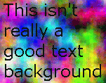 Check that the text has sufficient contrast to show up against the background. Conversely, if you're working on a wallpaper, or the background to some text, be aware that the text has to be readable. Some skin sites will rightly refuse a submission if it does not meet this basic requirement, no matter how good it looks on its own.
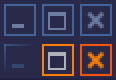 Your interface should react visibly to the user's actions. Take advantage of mouseover, pressed, and other state-specific images for skin elements if supported by your skinning format - each state should be distinctive, as shown to the left. Make it easy for the user to tell when a click will have an effect - and what that effect will be! Some authors use text labels made visible on mouseover - this can be effective if done well.
Use Fitts' Law. Without going into the mathematical details, Fitts' law states that the time to acquire a target depends on the distance to and size of the target. This means that the fastest places to click are the current position of the cursor and the bottom right, top left, top right and bottom left corners of the screen, in that order - try it for yourself! They're fast because you can just "throw" the mouse cursor there rather than having to position it carefully.
This simple rule can make a huge difference to the usability of your skins - ensure your start button is tall enough to cover the bottom left pixel and the close buttons cover the top right when a window is maximised and people will love your skin, often without knowing why. Similarly, if you have menus, buttons and other clickable objects close to an edge of the screen, adjust their activation areas so that they extend right up to and include the edge.
Treat animation with caution. Sure, that set of flashing lights may make your skin stand out - but how long before it's an annoyance? Animation in skins has two main purposes:
- To attract attention to events
- To add to the character of a skin
For the first, bright pulsing flashes and exaggerated motion may indeed be appropriate. If you are seeking to create and sustain a mood, keep it smooth and subtle.
Ensure your skin is consistent, in appearance and in action. If moving the mouse over one button makes it glow, moving over another sort of button should make that glow too. Choose a colour scheme and stick to it, using complimentary colours for similar objects and contrasting colours or changes in brightness to highlight differences. Use familiar colours to imply meaning, such as red for potentially dangerous actions (closing a window, deleting a file) and green for confirmation. Subdued blue and grey are popular base colours, because they relax the eye - however it's possible to use almost any colour to good effect.
 Quick Hint: About one in ten males have some form of colour-blindness. You might want to check that your skin looks reasonable in their eyes. Use symbols as well as colours - a red cross and a green tick will probably retain their meaning even if a user can't distinguish red and green.
Use familiar elements from daily life that are appropriate to the skinned item. If you're making an icon for a document then it should look like a document, not like a watering can or a supernova. For window skinning, the buttons should all be clearly identifiable as buttons, and their purpose should be plain to the user without having to mouse-over them or (worse) try them out. And remember, sometimes the best identifier is text. If you can't think of a good icon, use a word instead.
If your skin extends to defining menus, try to keep the number of items on each menu less than ten - that way people are more likely to remember exactly where the option they want is. At the same time, don't make your users go through too many levels to get to something, especially if it's a frequently used item.
This site is copyright ©2003 Laurence "GreenReaper" Parry. Got comments? Mail me.